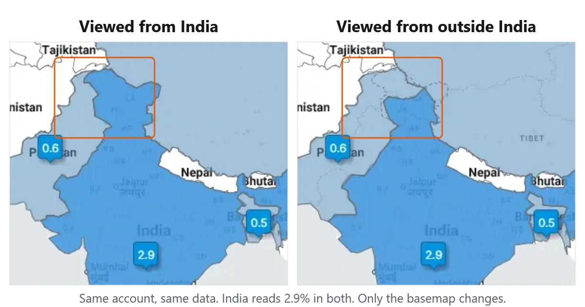
You open your followers map, look at the country you know best, and something is off. A border sits in the wrong place. A lake or a gulf carries a name you’ve never called it.
Online maps look different depending on where you open them because mapping providers serve different versions of the same map to different countries. Where two countries disagree about a border or a place name, a provider like Google Maps renders a version that matches local expectations and local law — a solid boundary line for viewers inside one country, a dashed one for everybody else. Fedica draws follower, hashtag, and engagement data on top of basemaps we don’t produce ourselves, so the same regional differences show up in your analytics. The data underneath never changes. Only the map under the data does.
We’ve been mapping social media audiences since 2011, back when Fedica was called Tweepsmap, and this is one of the questions we get asked most.
Why the Same Map Shows Different Borders
Border personalization is the practice of serving different versions of a map depending on the country the viewer is in. It isn’t rare and it isn’t new.
Researchers at Northeastern University and the University of Illinois built a system called MapWatch that crawled the image tiles behind Google Maps and Bing Maps from the perspective of every country in the world. Over nine months they found personalized borders across seven separate geopolitical conflicts: the Sino-Indian border, Kashmir, Crimea, Argentine Antarctica, the South China Sea, Western Sahara, and South Ossetia.
India is the clearest example, because the difference is easy to see side by side.
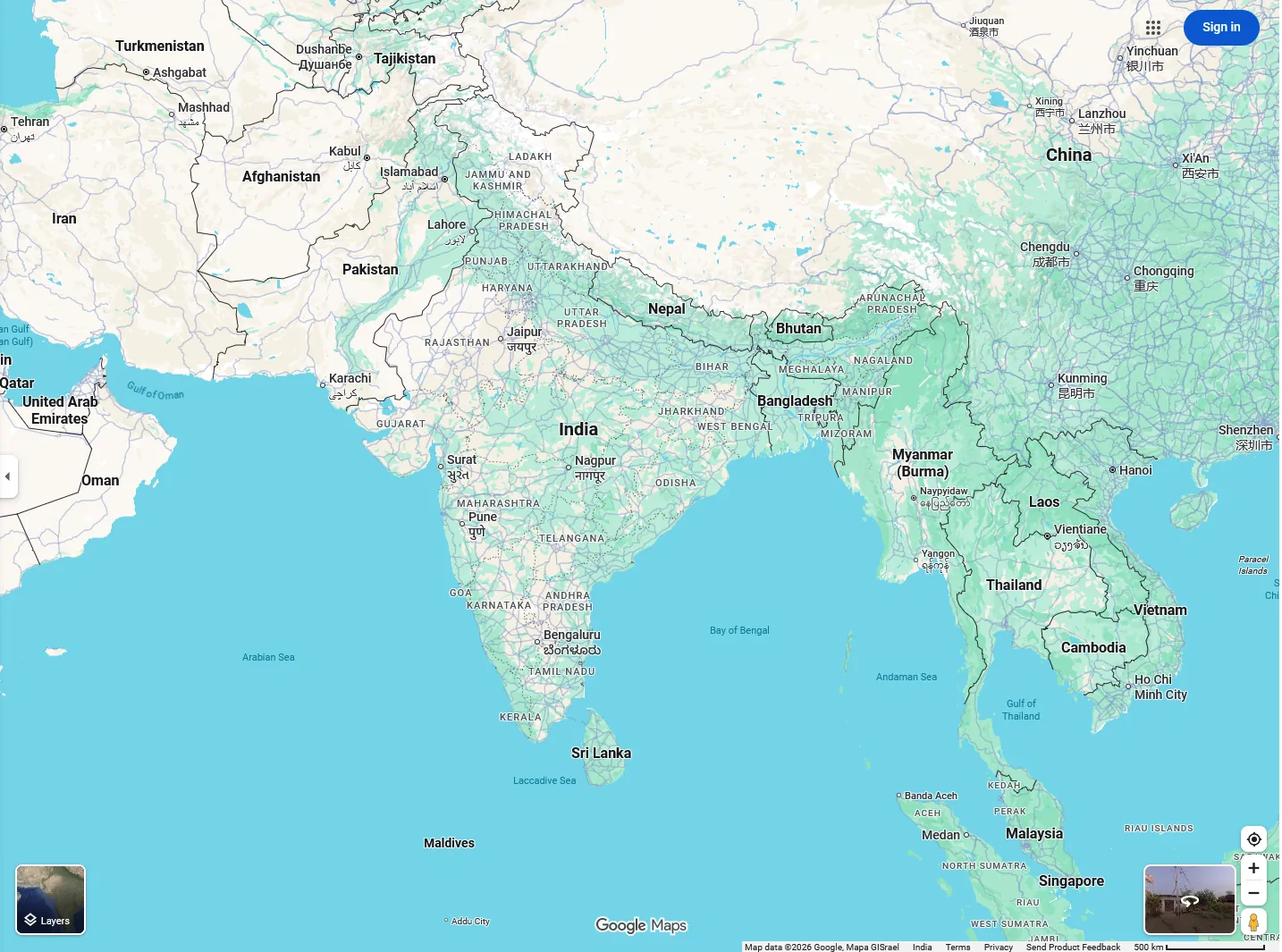
Viewed from inside India, Google Maps draws Jammu & Kashmir and Ladakh inside a solid international boundary. Viewed from Canada, the same boundaries render as dashed lines, a dotted line appears further east along Aksai Chin, and the northern edge of Uttarakhand switches to dashed as well.
Google Maps, viewed from India
Google Maps, viewed from Canada
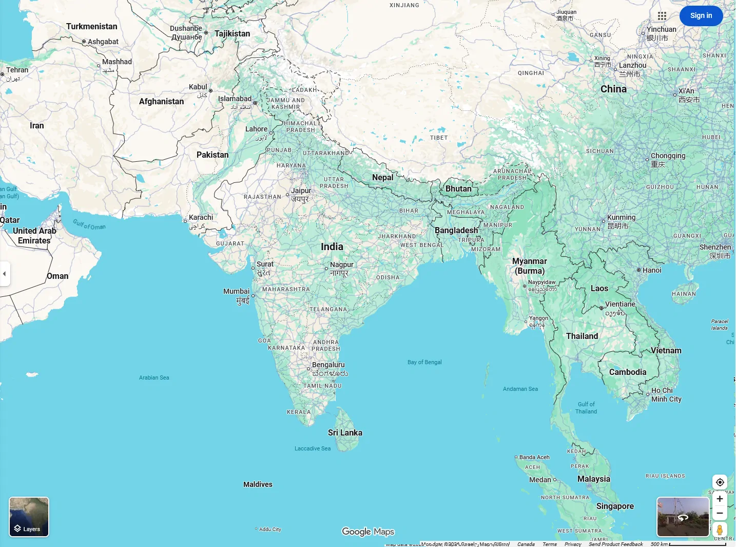
Look at the fine print along the bottom of each screenshot and Google names the country it served the map to. One reads Map data ©2026 Google, Mapa GISrael India. The other, captured the same day, reads Canada.
What Dashed and Dotted Lines Mean on a Map
When neighbouring countries don’t agree on where a border sits, the general cartographic convention is to draw it as a dashed or dotted line instead of a solid one. A solid line says this boundary is settled. A broken line says it isn’t.
That convention is why the same stretch of the Himalayas can look decisive on one screen and provisional on another. Nothing about the terrain changed between the two screenshots. The line style did.
Some countries legislate how maps of their territory must be drawn, which is why providers maintain regional versions at all. India, Pakistan, and China all claim parts of the northern regions of Jammu & Kashmir, Ladakh, and the northeastern state of Arunachal Pradesh, and each expects to see its own claim reflected.
Honestly, we don’t envy anyone in the map-making business. There is no single version that satisfies everyone.
Names Change Too, Not Just Lines
Borders get the attention, but place names work the same way, and the United States has produced two examples in the past two years.
In January 2025, an executive order renamed the Gulf of Mexico to the Gulf of America in US federal usage. Google explained its approach in a post on 27 January 2025: “When official names vary between countries, Maps users see their official local name.” People in the US would see Gulf of America, people in Mexico would keep Gulf of Mexico, and, as Google put it, “everyone in the rest of the world sees both names.”
It happened again this month. On 27 August 2026, an executive order directed the Interior Department to rename Lake Ontario to Lake America in the federal geographic naming service, with a 30-day window to update the records. Google confirmed in a blog post on 29 August 2026 that US users would see Lake America while users in Canada continue to see Lake Ontario, and everyone outside the two countries sees both. Canada rejected the change; Ontario’s premier put up a lakeside sign reading “Lake Ontario: Now and Always.”
Three versions of one lake, decided by where you’re standing.
| Place | Seen from one country | Seen from the other | Seen everywhere else |
|---|---|---|---|
| Jammu & Kashmir and Ladakh | From India: solid boundary, region drawn inside India | Not applicable | Dashed and dotted boundary lines |
| Gulf of Mexico / Gulf of America | From the US: Gulf of America | From Mexico: Gulf of Mexico | Both names shown |
| Lake Ontario / Lake America | From the US: Lake America | From Canada: Lake Ontario | Both names shown |
How Fedica’s Follower Map Handles Disputed Areas
Here’s the part worth being straight about: Fedica doesn’t draw the borders. Our interactive followers map renders on Google Maps. Other maps we produce are built on public domain map data instead. Either way we’re overlaying your analysis on a basemap somebody else drew, so when a boundary is disputed, you’re seeing what that source provides, the same as on any other site.
Fedica uses the same regional strategy the big providers use. Different versions of the map render depending on where you log in from.
On the followers map, the difference goes further than line style. Viewed from India, Jammu & Kashmir and Ladakh are filled with India’s data colour, the same shade as the rest of the country, inside a solid boundary. Viewed from outside India, the disputed area is bounded by dotted lines and drops out of India’s fill to the neutral shade. The shaded region itself changes shape.
Fedica’s followers map, viewed from India

Fedica’s followers map, viewed outside India

Your numbers do not change. In the two screenshots above, captured minutes apart from different locations, India reads 2.9% in both. So does Pakistan at 0.6%, Bangladesh at 0.5%, Japan at 0.6%, and Singapore at 0.3%. The analysis is identical. The basemap underneath it is not.
Name changes are easier on us than border changes. Our followers map labels countries and cities, not oceans and lakes. Follower locations are keyed to country, state, and city, so the Gulf of America and Lake America renamings don’t touch your numbers either.
That distinction matters when you’re reporting to a client. If you drill into a country to see which followers are there, the list you get is the same list wherever you’re sitting, and so is every other number in your follower analysis.
The One Thing Region-Specific Maps Can’t Fix
Serving a region-appropriate map solves the problem inside the product. It breaks the moment you take a screenshot.
A screenshot always looks the same no matter where it’s viewed from. So when you capture your followers map in Mumbai and post it to X, every follower who sees that post sees the version India was served — including followers in countries that render those borders differently. Capture the same map in Toronto and the reverse happens.
There’s no technical fix for that. Once the map is a flat image, it has stopped adapting to anyone. It’s frozen at whatever your location rendered.
What we usually suggest is pointing people to the live map rather than a picture of it, so the map renders for whoever is looking at it. It isn’t a perfect answer. It’s the honest one.
The Other Reason Maps Look Different: Flattening a Round Planet
Borders and names explain most of what people notice in a followers map. There’s a second reason maps disagree, and it has nothing to do with politics.
A map projection is a method for representing the curved surface of the Earth on a flat plane. Every projection distorts something, because a sphere cannot be flattened without stretching or tearing. The choice is what to sacrifice: area, shape, distance, or direction.
Most online maps, including our interactive followers map, sit on a variant of the Mercator projection. Gerardus Mercator published it in 1569 for marine navigation, where its preservation of direction was worth the trade-off. That trade-off is size at high latitudes: on a Mercator map Greenland looks comparable to Africa, when Africa is roughly 14 times larger.
Alternatives exist. The Equal Earth projection, published in 2018, keeps relative land areas true, and in August 2025 the African Union endorsed a campaign to adopt it in place of Mercator. Cartography studio Axis Maps keeps a clear guide to projection trade-offs if you want to go deeper.
For follower analysis it rarely matters, because you’re reading country-level percentages, not measuring land. It’s worth knowing about when a map of your audience makes a sparse northern country look more important than its numbers say.
Frequently Asked Questions
Why does Google Maps look different in India?
Google Maps serves a version of its map that reflects local expectations and local law in each country. Viewed from inside India, Jammu & Kashmir and Ladakh appear inside a solid international boundary. Viewed from most other countries, those boundaries render as dashed or dotted lines to indicate a disputed border.
Why do maps show different borders in different countries?
Mapping providers maintain regional versions of their maps because some countries legislate how their territory must be depicted. MapWatch research presented at the 2016 World Wide Web Conference found this practice across seven geopolitical conflicts on Google Maps and Bing Maps, including Kashmir, Crimea, the South China Sea, and Western Sahara.
What do dashed lines mean on a map?
A dashed or dotted boundary line is the general cartographic convention for a border that neighbouring countries do not agree on. A solid line indicates a settled boundary. The line style tells you about the status of the border, not about the terrain.
Does my follower count change depending on where I log in?
No. Fedica’s follower data is identical regardless of your location — only the basemap rendering changes. In two captures of the same account taken from different countries, India read 2.9%, Pakistan 0.6%, and Bangladesh 0.5% in both.
Why does the map in my screenshot look different from the one my followers see?
A screenshot is a flat image, so it no longer adapts to whoever is viewing it. It stays frozen at whatever your location rendered when you captured it. Anyone viewing your post sees your version of the map, not the version their own country would be served.
Which world map is the most accurate?
None of them, in the sense of being distortion-free — every flat map trades away accuracy in area, shape, distance, or direction. Equal-area projections such as Equal Earth, published in 2018, preserve relative land sizes, while the Mercator projection used by most online maps preserves direction and exaggerates area away from the equator.